A quieter Konstantly: a new look, and editors built around your content
The biggest Konstantly release since 2.0. A calmer design across the whole app – one main button per page, rows instead of boxes – and rebuilt editors for lessons, tests, surveys and certificates, with Ask beside your work.

Training software tends to grow by addition. A new feature gets a new button, the button gets a panel, the panel gets a border, and one day the screen is mostly frames around other frames.
This release goes the other way. We went through Konstantly page by page and asked the same question of everything on it: does this help the person finish what they came to do? What didn't, we removed. What stayed got quieter. And the editors – where authors spend most of their time – were rebuilt so the content is the largest thing on the screen.
Here is what changed, and how it works.
One main button per page
Open any page and there is one dark button on it. On Courses it is Create. On a draft it is Publish. On your account's forms it is Save, and it turns dark only once you have changed something.
That is the whole rule, and it does a lot of work. You no longer scan a toolbar to find the next step. Secondary actions are still there – in a row's menu, or as plain grey buttons – but they don't compete.
Rows, not boxes
Lists used to arrive in several shapes: cards on one page, a bordered table on the next, panels inside panels in Settings. They are all rows now.
- Every management page opens the same way: a title, the views with their counts, a search, and one filter menu that also holds the sort.
- Tables lost their frames. One header, one pager, no box around the box.
- Figures are tiles and charts are quiet. Analytics shows the number first and the decoration last.
- Settings are sections and rows, including Licence and Billing. Limits show as a row with a thin bar instead of a dashboard.
- Waiting, empty and failed look the same everywhere. A list that is loading is drawn in the shape of what is coming. A list that failed says so once, with Retry.
On a phone the same lists stay as rows instead of squeezing a table into a small screen.
Care for every language
Konstantly runs in fourteen languages, two of them written right to left. This release went through the app in Arabic as carefully as in English.
Dates, numbers, averages and percentages now follow your interface language everywhere. Long names shorten from the correct end, so an Arabic list with an English name in it still reads properly.
Home starts with a sentence
Home is a greeting and one box to type in. Describe a course, ask a question, or ask to be taken somewhere.
When Ask Konstantly builds something, the answer is one sentence and the course it made, ready to open. Your three most recent chats sit underneath. On your first day, Home points you to the short getting-started videos instead.
You can attach a PowerPoint, a Word document or a PDF as source material, and the course is drafted from it. If a file can't be read, or is too large, Home tells you which it was and why.
Describe the course; the outline comes back as steps you can open
More on what the assistant can do: AI course assistant.
A lesson editor that gets out of the way
The lesson editor is the screen we changed most.
Slides live in a strip along the bottom. The slide you are editing has the room. Open the grid view to see the whole lesson, select several slides, and move or delete them together.
Tools appear where you are working. Select text and its formatting floats beside it. Select a picture and you crop it right on the slide. With nothing selected, the side panel shows the slide's own settings – its layout, background and theme.
Layouts keep your content. Pick a different layout – two columns, a comparison, a quote, steps, a timeline – and the slide rearranges around the text and pictures already on it. You can try three layouts in a row and lose nothing.
Pick a layout; the slide rearranges and keeps what was on it
An empty slide tells you where to start. Click the faint title or text to type, or let Ask write the slide.
Speaker notes sit under each slide. Learners never see them; they are for the person presenting, or for the narration script.
Slides and video are one editor. A lesson that plays against a video has a Slides | Video switch at the top instead of a separate screen. The video timeline shows the waveform, lets you trim the start and end, and has each slide's actions on its thumbnail.
See the editor in full: Page and lesson editor · Video lessons.
Ask, beside your work
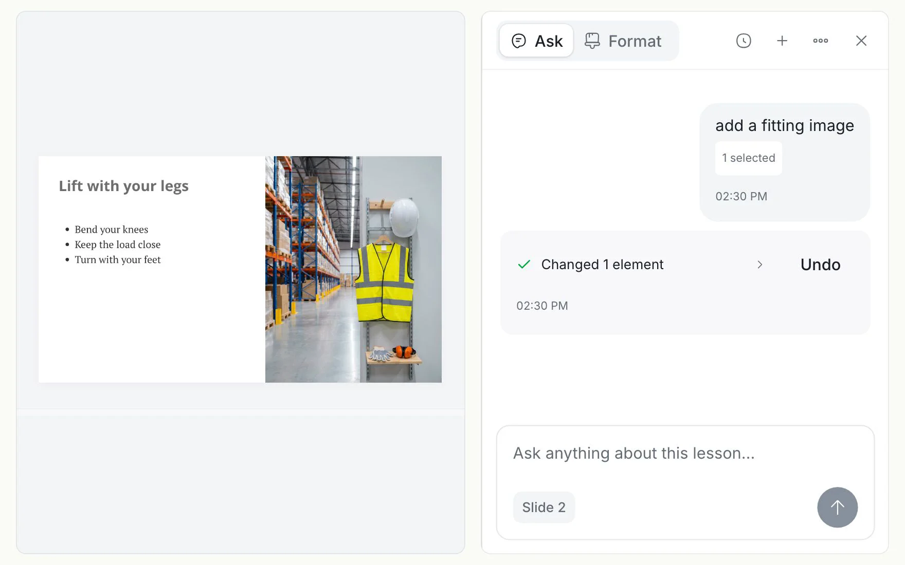
The lesson, test and survey editors and the course builder each have an Ask panel. In the lesson editor it does three things that make it worth using.
- It works on what you selected. A small chip above the box names the target – this slide, slide 4, or five selected slides – before you send anything.
- It suggests a next step. Up to three short suggestions sit above the box, chosen from the state of the slide: make a title slide, suggest a layout, write speaker notes.
- Every change can be undone. An AI edit is one step in the editor's history. Press Undo and the slide is exactly as it was.
It can also read slides that were imported as pictures, so an old PowerPoint is something you can ask about, not just look at.
Ask changes the slide you are on, and Undo takes it back
One frame for tests, surveys and certificates
Tests, surveys, certificates and course themes used to be four different-looking tools. They now share one frame, so they behave the same way:
- the name, the save status and Preview across the top;
- your work in the middle;
- one panel on the side, with tabs.
Tests and surveys
The questions are a list on the left. Add one by type, drag to reorder, or import questions from another test. The question you are editing sits in the middle as a card.
Settings moved out of a pop-over and into the Settings tab of the side panel – attempts, time limit, passing score, question order – so you can change them while looking at the questions.
The Ask tab writes questions for you. Say what you need – "ten questions on fire safety" – read what comes back, and press Apply to add them to the test.
Ask for questions; Apply adds them to the test
More: Assessments · AI tests assistant.
Certificates
The certificate editor is new. Choose one of three designs – Modern, Formal or Minimal – then set your accent colour, the typeface, your logo, a signature and, if you like, your own background. The wording has its own tab.
The preview fills in a sample learner. Switch it to a long name, or to names in several scripts, and see that the text still fits before anyone earns one. Certificates you designed before are still there and still work, and certificates already issued keep the design they were issued with.
Choose a design, set the colour, check it with a long name
The course builder, by its plain name
We stopped calling it Pathboard. It is the course builder, because that is what everyone called it anyway.
It works the way it has since summer, with the new look: a course starts as a list of steps, and Add branching opens the map when the course needs different routes for different learners. Going back to a list is offered only when nothing would be lost.
A list of steps first; the map when the course needs routes
More: Course builder.
Courses that look finished from the first minute
The course page opens with a wide cover. Below it is what the course is about and what is in it, step by step. Authors also get a short list of next steps – build the course, add a cover, describe it for learners, assign it – that ticks itself off. Learners see their own progress, the step they are on, and their certificate once they earn it.
Covers. A course with no picture used to be a grey tile. Now it gets a drawn cover in its own colour, with a simple mark, so a new library looks like a library. Upload or pick a photo whenever you like and it takes over.
The library. Courses has Drafts, Published and Collections as views of one list, with the sort in the filter menu and a grid or list toggle that remembers your choice. My learning leads with the course to continue and what is due this week, then Assigned, In progress and History – plus your certificates.
Smaller things you will notice
- An imported PowerPoint or PDF lesson shows where it is: converting, ready, or failed, with the reason.
- Dialogs behave the same everywhere, and focus goes back to where you were when one closes.
- Editors, lists and dialogs are easier to use with only a keyboard, and with a screen reader.
- On an overdue account, saving a new card tells you what happened to the payment.
What you need to do
Nothing. There is no setting to turn on and nothing to migrate. Your courses, lessons, tests, surveys and certificates open in the new editors exactly as you left them.
The knowledge base has been updated to match.
New plans and pricing
This release also comes with new plans and pricing. The pricing page has everything, so we won't repeat it here.