A Quieter Konstantly: A New Look and New Editors
The whole app has a calmer design – one main button per page, rows instead of boxes – and the lesson, test, survey and certificate editors have been rebuilt around one frame, with Ask beside your work.
This is the largest release since Konstantly 2.0. Almost every screen changed, and most of the change is things we took away.
The full story is in the blog post: A quieter Konstantly.
A calmer app
Every page now has one main button. It is dark, it is in the same place, and it is the thing you most likely came to do. Everything else on the page is quieter than it.
Lists are rows. Courses, people, groups, reports, invoices and settings used to be a mix of cards, boxed tables and panels. Now they read the same way everywhere: a page top with the title, the views and a search, then rows.
Editors built around your content
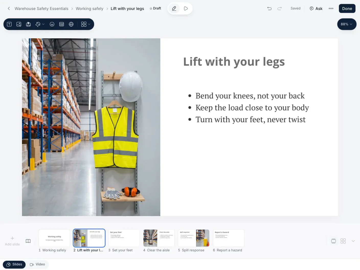
The lesson editor keeps slides in a strip along the bottom and puts the tools where your hand already is: text formatting floats next to the text, pictures crop on the slide, and a layout rearranges a slide without losing what was on it.
Ask sits beside the slide. It works on what you have selected and says so before it starts. If you don't like the result, Undo takes the whole change back.
Tests, surveys, certificates and themes now share the same frame: the name and save status at the top, your work in the middle, and one panel on the side. In tests and surveys that panel holds Ask and Settings. Learn one editor and you know the others.
Courses that look finished
A course page opens with a wide cover and shows what is inside. Authors get a short list of next steps – build, add a cover, describe it, assign it. A course with no picture gets a drawn cover in its own colour.
Getting started
New plans and pricing arrive with this release; the pricing page has the details.
Nothing to switch on. The new design and editors are there the next time you sign in, and your courses, tests and certificates open in the new editors as they are.
Improvements23
- Designone main button per page, in the same place, so the next step is never a guess
- Designlists are rows, not boxed cards – Courses, People, Groups, Reports, Settings and Billing all read the same way
- Designevery management page opens with the same top – title, views with counts, search, one filter menu
- Designcalmer colours, quieter charts and figures, and one face for loading, empty and failed states
- Languagesdates, numbers and percentages follow your interface language; Arabic and Urdu layouts got a full pass
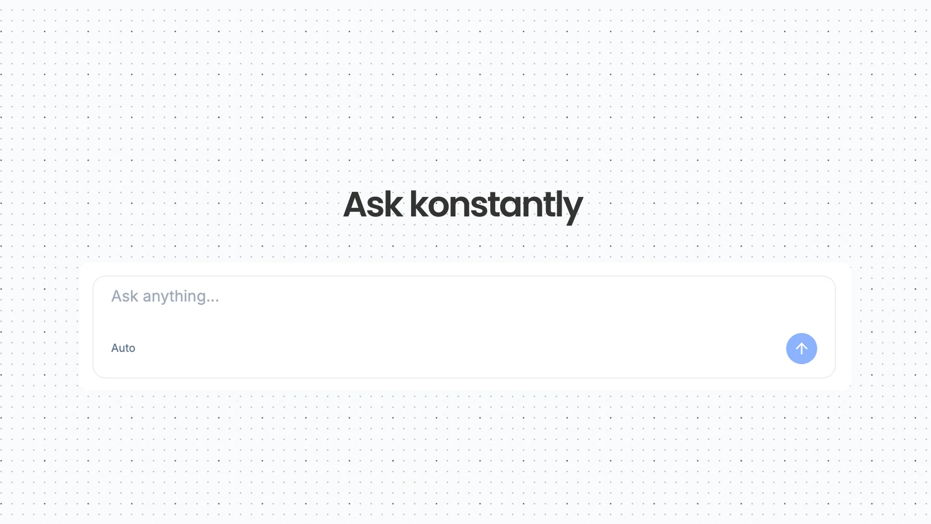
- Homeone greeting, one composer, and each result as one sentence with the course it made
- Homeattach a PowerPoint, Word document or PDF as source material – and get a plain reason if a file can't be used
- Lesson editorslides sit in a strip along the bottom, with a grid view for reordering
- Lesson editorlayouts rearrange a slide and keep its content
- Lesson editorAsk works on what you have selected – a slide, several slides, or the whole lesson – and every AI change can be undone
- Lesson editorspeaker notes for each slide, and one editor for slides and video with a Slides | Video switch
- Tests and surveysa question list on the left, the question in the middle, and Ask and Settings in one panel
- Tests and surveysask for questions in plain words, review them, then Apply
- Certificatesa new editor with three designs, your brand colour and logo, and a preview that tries long and multilingual names
- Course builder'Pathboard' is now simply the course builder – start with a list of steps, add branching when you need it
- Course pagesa wide cover, what's inside, and a short list of next steps for authors
- Coursesone library with Drafts, Published and Collections; My learning shows what to continue and what is due this week
- Coversa course without a picture gets a drawn cover of its own instead of a grey tile
- Importsa PowerPoint or PDF lesson shows whether it is converting, ready, or failed
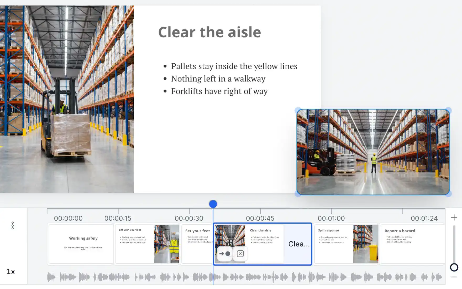
- Video lessonsa fuller timeline with a waveform, trimming, and slide actions on each thumbnail
- Billingupdating your card on an overdue account tells you what happened to the payment
- Accessibilityeditors, lists and dialogs work better with a keyboard and a screen reader
- Pricingnew plans and pricing arrive with this release – see the pricing page